Sure.
The Exposure series is the fourth series that I composed during my experimentational artistic discovery period and that it required two years of refinement before being published to the public.
The Exposure series has been composed and designed in conjunction with all other series since 2017.
The establishment of the studio in Madrid in 2018 to begin the experimental work of discovering fine art papers and for the calibration of my digital printers required a lot of time and delays.
During that period, I had to refine and perfect the digital hatching and cross-hatching technique of the three published series in middle of 2018: Receptors, Rainbow and Polarization
While perfecting my digital and printed body of work, I was also working on a crowdfunding campaign in order to gather funds to support my studio and my first solo exhibitions.
This meant that I had little time to work on the Exposure series.
So, it was not possible for me to release the Exposure series to the public in 2018, because it was not artisticaly and technically composed the way I wanted it to.
I finished the series in the time available during my weekends and also after I was forced to temporarily close the studio in late 2018 due to lack of funds.
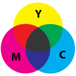
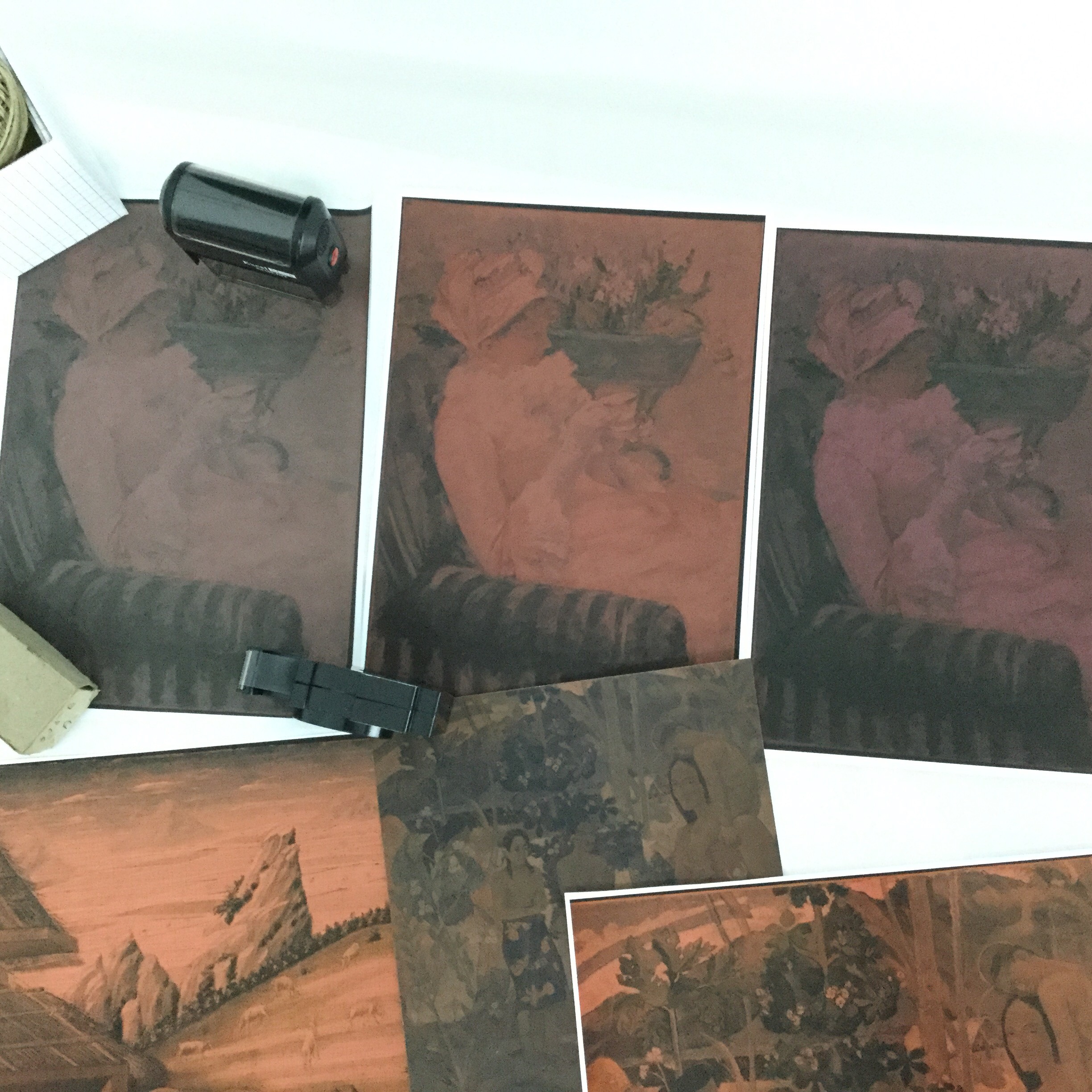
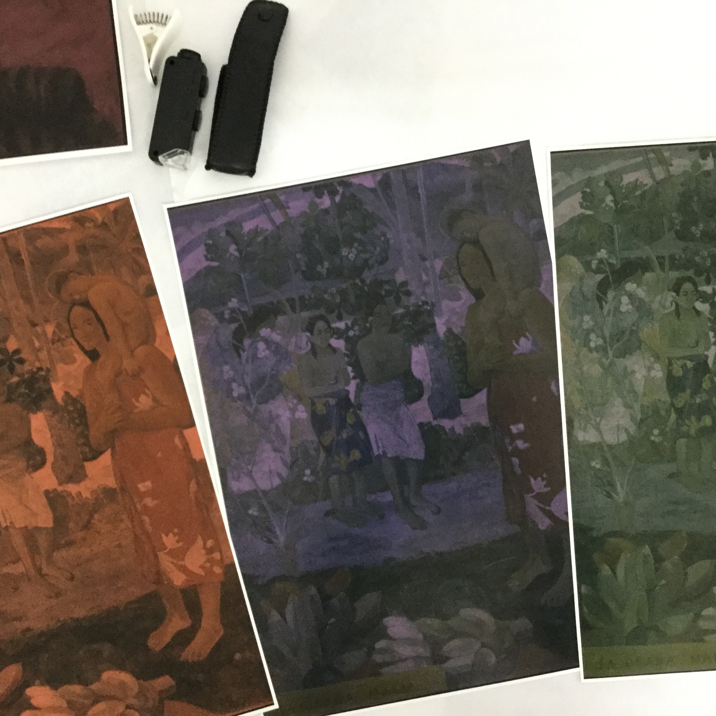
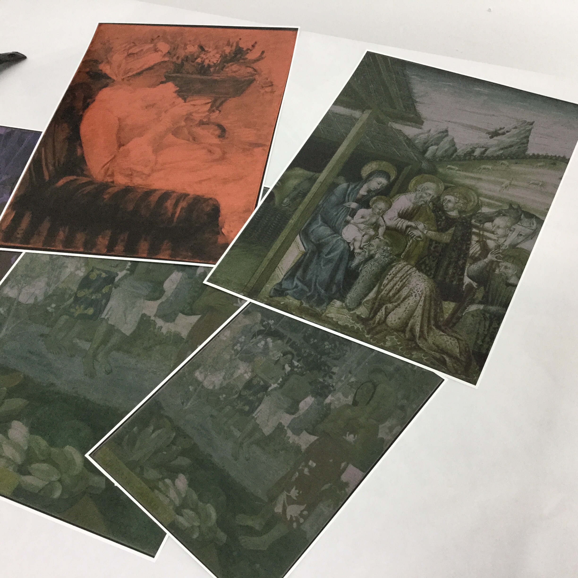
The Exposure series combines an artistic perspective on the concept of multiple realities of quantum mechanics with a technical perspective under the digital process between the RGB / CMYK colour model parallel.
The Exposure series is also a transversal series that connects the other series: Receptors, Rainbow, Polarization.
It's a physical fine art photography lens from which the concept of multiple realities is revelead to the viewer within the Revelation installation series.
The Exposure series incorporates the physical light-sensitive process after photographic exposure to light to also compose the revelation of the transition from the digital additive RGB colour model into the printed subtractive CMYK colour model.
The painted juxtaposition of chiaroscuro, is artisticaly composed to symbolically contrast not only the additive versus subtractive colour models but also the Negative versus Positive film photography revelation process and that ultimately reveals to the viewer the physical nature of reality of the CMYK pixel strokes that are ultimately printed on fine art paper.
Even though all of the artworks are digitally painted using Red, Green and Blue colours, due to the nature of the physical properties of light, digital printers use a subtractive color model to print photographies on paper.
All of my body of work is printed today on modern digital 12 inkjet printers, but this dichotomic paradox of additive and subtractive color model embodies all of my body of work.
The CMYK patterns are in fact the only real physical reality. All other colours are a part of only the imaginary reality of the observer.
It's this dichotomic paradox that the Exposure series ultimately reveals to the viewer and places the viewer on the center of the narrative of the imaginary composition reality of complementary colours.
I believe my choice is the culmination of the growing interest in science and physics, and the search for my passion.
When I was young, physics did not interest me at all. I was bad at physics.
I really can't explain why my curiosity grew over the years. I just found it more fascinating over the years for some reason.
During the last 14 years of my life, I was fortunate enough to have been inspired by the incredible teachings of Richard Feynman.1.
His ability to convey complex/advanced knowledges of physics to an ordinary person is remarkable. You can't help but to feel excited about physics.
I feel incredible lucky to have found his The Feynman Lectures on Physics, and to have also discovered several of his video lectures series online.
His Theory of Quantum Electrodynamics2 has completly changed how we understand the world we live in.
And, how we can explain the fundamental physical properties of light.
After I had quit my job in search for my passion, quantum physics(light in particular) was the only subject that I had on my mind that I trully enjoyed thinking about.
Quantum Mechanics gives us one of the most counter-intuitive notions of the reality of the World we all live in.
And, it is the most intelectual and fascinating subject that has sparkled my curiosity of thought ever since I started reading about it.
I find it absolutely fascinating.
During my sabatical year, I felt compelled to create a unified body of work to be able to express myself about the incredible scientific mistery of our Universe.
And, I felt compelled to do it through the world of Art.
I can't explain why this has happened.
I was just searching for my passion.
It felt like it was what I really wanted to do.
1Richard Feynman was an American theoretical physicist known for his work in the path integral formulation of quantum mechanics, the theory of quantum electrodynamics.
Richard Feynman is either a trademark or registered trademark of Richard Feynman Estate.
The reference for his groundbreaking Quantum Electrodynamics Theory has been legally approved by Richard Feynman's Estate.
The focus of the observation experience of the viewier is deeply connected with all of the knowledged that I had about the Wave Function Collapse in Quantum Mechanics.
The observation is at the very core of the Wave Function Collapse, and I wanted to express that counter-intuitive nature of Quantum Mechanics directly with the viewer.
Sure.
There are several aspects of my artwork that I need to explain first, to help you understand everything.
Overall
In both digital and printed artwork, I wanted the colored observation experience to be as much as consistent as physically possible.
I wanted the printed artwork to have the same colour observation experience as the observation experience in digital form.
Digital Observation
In normal lighting conditions1 the digital observation experience is mangled with the your reflection and the refraction properties of the transparent materials of computer monitors.
This means, that when you observe my colored photographs the colour that you observe is the direct result of the mixing of light waves of your reflection with the refraction properties of monitors, combined with the RGB colour palette of my photographs.
In practice, what you observe is not the original RGB color palette of the photograph that I have designed.
And, that's because when you observed you also introduced changes in the color information that is observed by introducing your reflection to the observation experience.
By observing you changed the physical form of the light waves that were originally sent from the monitor of the original RGB color palette.
The observation action, plays a critical role in Wave Function Collapse in Quantum Mechanics, and I wanted to reflect that action in all of my artwork.
Printed Observation
When observing the printed artwork, I wanted the viewer to have the same colored observation experience in normal lighting conditions1 as in digital form.
And, place the viewer at the center of an intimate and unique narrative in creation of secondary colours in both digital and printed artwork form.
1. Viewing the photographs from different angles of the computer monitor produces different digital colored observation results, since you reduce and change the reflection source, and thus you view the photograph with different colours. "Normal lighting conditions" means observing the photographs in front of your monitor in regular "front-side" angles. It is this digital observation experience that I wanted to bring to printed form.
My curiosity for Quantum Mechanics started as a hobby many years ago, before I even went to college.
It was one of the most counter-intuitive notions of reality that I ever came across and I found it puzzling.
Because I did not have a physics background it was very hard to try to understand why that was.
But, the fundamental principles of Quantum Mechanics are so puzzling and almost science fictional that I just kept researching and reading more and more about the subject.
It became my favorite hobby and I eventually wrote a research paper about Quantum Computation in University.
The research paper is in Portuguese, but if you are still interested in having a read through you can download it from my website here.
The inspiration in exploring digital photography is related with everything that I had learned about the physical properties of light.
Today, we take Photography for granted. We are now accustomed to them.
But, I find Photography to be more spectacular.
And, it is related with physics.
With photography we are able to capture a single moment in the past.
And, it is only possible through the physical properties of light.
I wanted to combine photography with all the knowledge that I had about physics and light.
I started working with the images myself through programming, to create the artistic composition that you see today on the website.
I would say its the artistic creative process, and the ability you have to express yourself.
I ended up exploring and researching traditional drawing and painting techniques to have an understading about the artistic process a traditional artist goes through in their artistic expression.
As I researched more about the subject, I found it to be more and more fascinating.
I started reading books, and also visiting Museum of Prado in Madrid.
And, I would find myself contemplating works of art for hours.
I have no idea why this has happenend.
But, I found it fascinating the incredible pacience, skill, and devotion of time that is required to create such magnificent masterpieces.
Once you start appreciating masterpieces, you really can't help but be fascinated by them.
The incredible precision and mastery one must perfect to create a painting by Hand.
I find it absolutely fascinating. I have probably spent hundreds(if not thousands) of hours contempleting the mastery of ancient paintings in my sabatical year, by visiting Prado Museum in Madrid, and also researching masterpieces online.
It is mind blowing.
This fascination was my main motivation to perfect, and use traditional drawing and painting techniques in my digital compositions.
The Pop Art movement is probably my main source of inspiration due perhaps how the movement broke barriers in conventional fine art in terms of representation and composition.
In some ways, I felt inspired by Pop Art to compose and represent a subject matter that is in some ways unconventional.
The Spanish painter: Juan Francisco Casas.
His portrayal of the "selfie generation" not only reflects the pinnacle of our social media society but the dedication of artistry craftsmanship in creating large-scale paintings.
The remarkable precision and mastery that he has it accurately reproducing light, shadow, and colour of an original photograph by Hand using only ball point pens, is just fascinating to me.
I find myself contemplating his body of work for hours.
I discovered his body of work in 2015, and his work inspired me to learn more about his drawing techniques. It was my first real admiration for a body of work. I hadn't an interest in Arts before that time.
His mastery of hatching and cross-hatching technique is my main source inspiration to continue to perfect my digital hatching and cross-hatching technique and that also had a life-changing impact about my interest in knowing more about the world of Art.
His body of work is regarded as one of the most important in the 21st century.
When I began this new journey in my life, I never had imagined that I would become a programming artist or even an artist per say.
It was only after going through my own process of artistic discovery and creation, that I learned to appreciate the importance of artistical expression.
An artistical expression is not as much about the artist that creates an artwork, but instead how the viewer interprets what the artist wants to express.
And, this is what motivates me to showcase my work, because I feel that it is important.
My style had several stages until it reached its current stage.
I do not have a degree in arts(or physics), and I wanted to learn how the concepts of shadow, and how light and color influences an artist drawing/painting in a physical canvas.
All of these concepts were self-taught.
The process itself was very mentally absorbing because, in the beginning, I was not seeing any results at all.
It then slowly evolved into digital form, because I also wanted to apply the same artistic concepts into drawing and painting an original photograph.
I wanted to combine light and primary colours, to properly convey my subject matter.
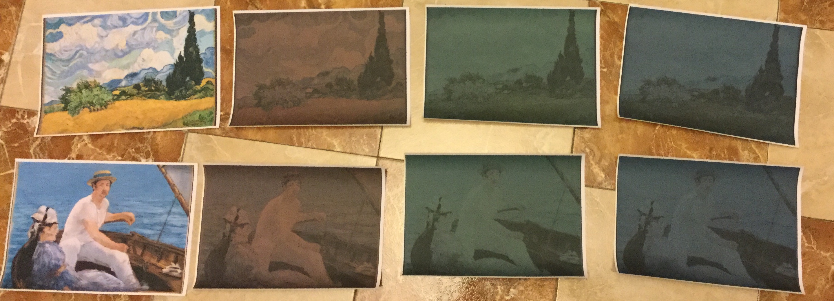
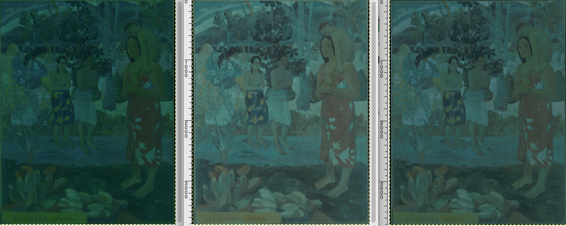
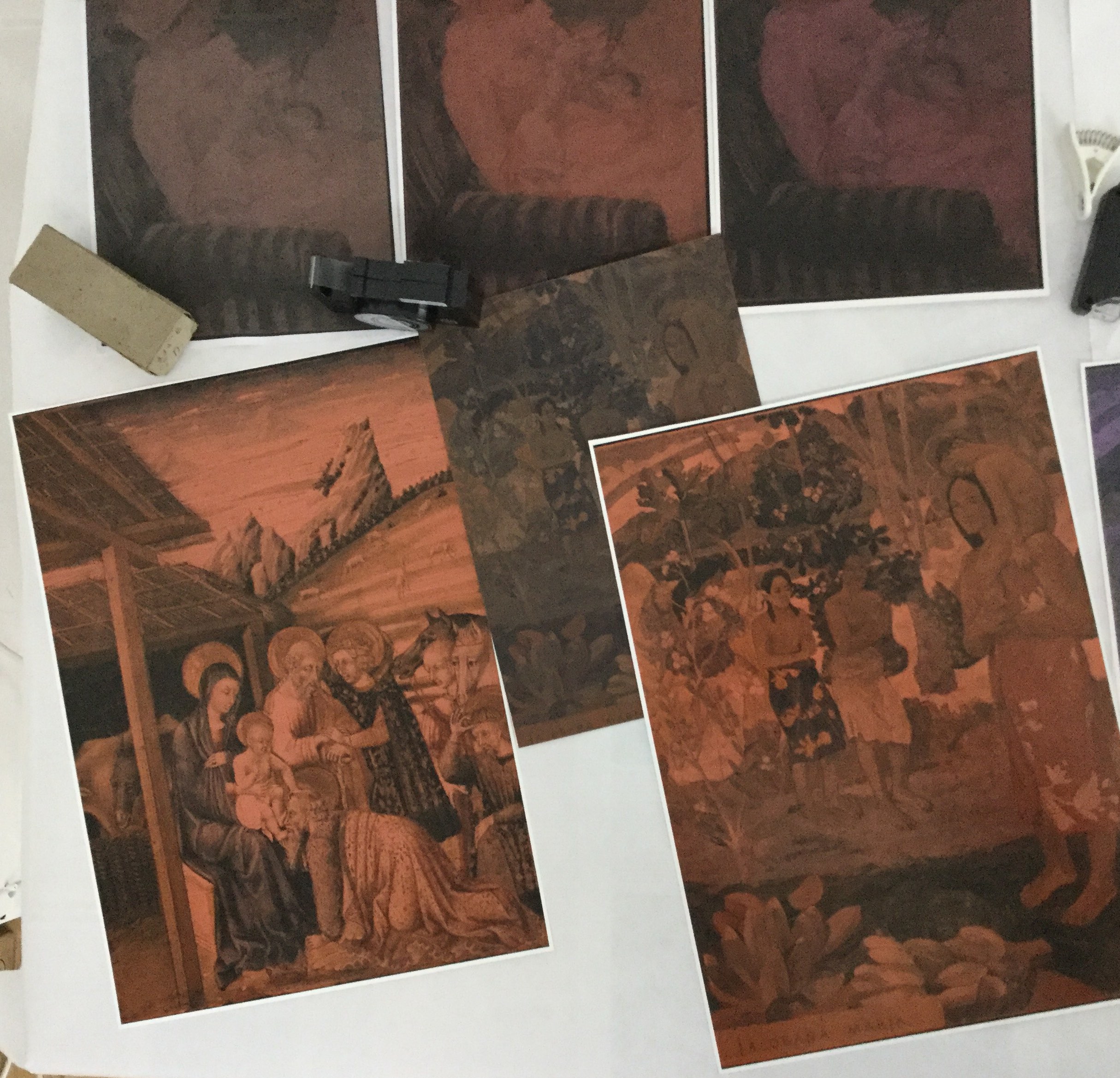
The primary colours are expressed in every single pixel of the final recreated photograph, and also on the final combined vintage look of the photograph: Red, Green Or Blue.
I digitally draw and paint the photograph without actually mixing primary colours inside each pixel. I literally don't create secondary colours inside any pixel of the photograph.
Each individual pixel is drawn and painted with only one of the three primary colours: Red, Green, Or Blue.
The main reason for this, is that I use digital mediums to express my art.
In traditional art painting(on a canvas for example), Red, Yellow and Blue are normally used for mixing primary colours.
But, digital paintings require a different primary colour approach, due to the fundamental properties of light used by computer screens to send the information of colour to the Human Eye.
Although I use the Red, Green, Blue primary colours in my digital paintings, I do not use the additive primary colour system to create secondary colours.
I do not mix any primary colours.
All of the mixing of primary colours are done entirely by the viewer themselves when they observe the digital paintings.
The viewer mixes the primary colours and paints the secondary colours through the laws of physics, and the nature of human biology.
I perfected a digital drawing and painting technique, that allows all of the colour mixing to happen when the viewer observes the digital painting.
Sure. My technique is strongly related to the study I made about traditional drawing and painting techniques.
I combine traditional hatching, cross-hatching techniques with colour, light and pixel manipulation to create the interlaced mesh of colour pixels that are required to draw and paint each digital painting.
Sure.
First, you need to understand a fundamental difference between how colours are displayed on a computer screen, and how colours are displayed on a piece of paper.
How is digital colour created?
Photographs displayed on computer screens or mobile phones, are rendered using a RGB Colour Model, which is known as the additive system.


Although the subject matter portrayed is the same, the themed based choice is related with the different reflections and different digital drawing and painting style techniques used.
The creative process for Receptors, Rainbow, Polarization , Exposure were composed during my sabatical year, during a period of reflection and expressionism in my search to properly convey what I wanted to express to other people.
Overall they reflect on the same subject matter, but the reflection and digital techniques used are substantially different.
This was the main reason why I choose to create the separate themed based series.
No, I don't.
Every design in all series, are created by own programming.
All series are painted without any AI, Machine Learning or any type of colour Data Mining anaysis.
It required two years of dedication to perfect the digital and printed hatching and cross-hatching technique of my four artistic debut series: Receptors,Rainbow,Polarization,Exposure
I find inspiration in the scientific mistery of life, relationships, and family.
I guess I am looking for inspiration all the time.
I create my art out of my studio in Madrid, Spain.
I maintain a very focused and distraction-free environment. I want to convey every bit of expression, in all of the stages of the digital printing process.
In the next years, I will be focused in digitaly printing the artistical compositions of my body of work, composed in my sabatical year.
And, I will also be focused in preparing, producing and promoting exhibitions of my artwork.
I am slowly reflecting, and exploring to create something visually very different, and it will be a new themed multi-series artwork.
And, I'll invite you to discover when I'm ready to display it.
The final produced artworks may have on average: 101 - 103 larger in size than the original photograph, depending on the original file.
And, all the processing and digital printing process takes on average 72 hours, until an edition is ready to be sent to you.
Explaining in words what I want to express.
It's the hardest challenge I've ever experienced in my life.
I have encountered several technical problems along the way.
But the main technological problem to solve was creating and producing the "same" observation experience in printed form, "as in" digital form.
The observation experiences plays a central action in my artistic representation of the Wave Function Collapse in Quantum Mechanics.
And, I wanted the observation experience in printed form to properly represent the digital observation experience as well.
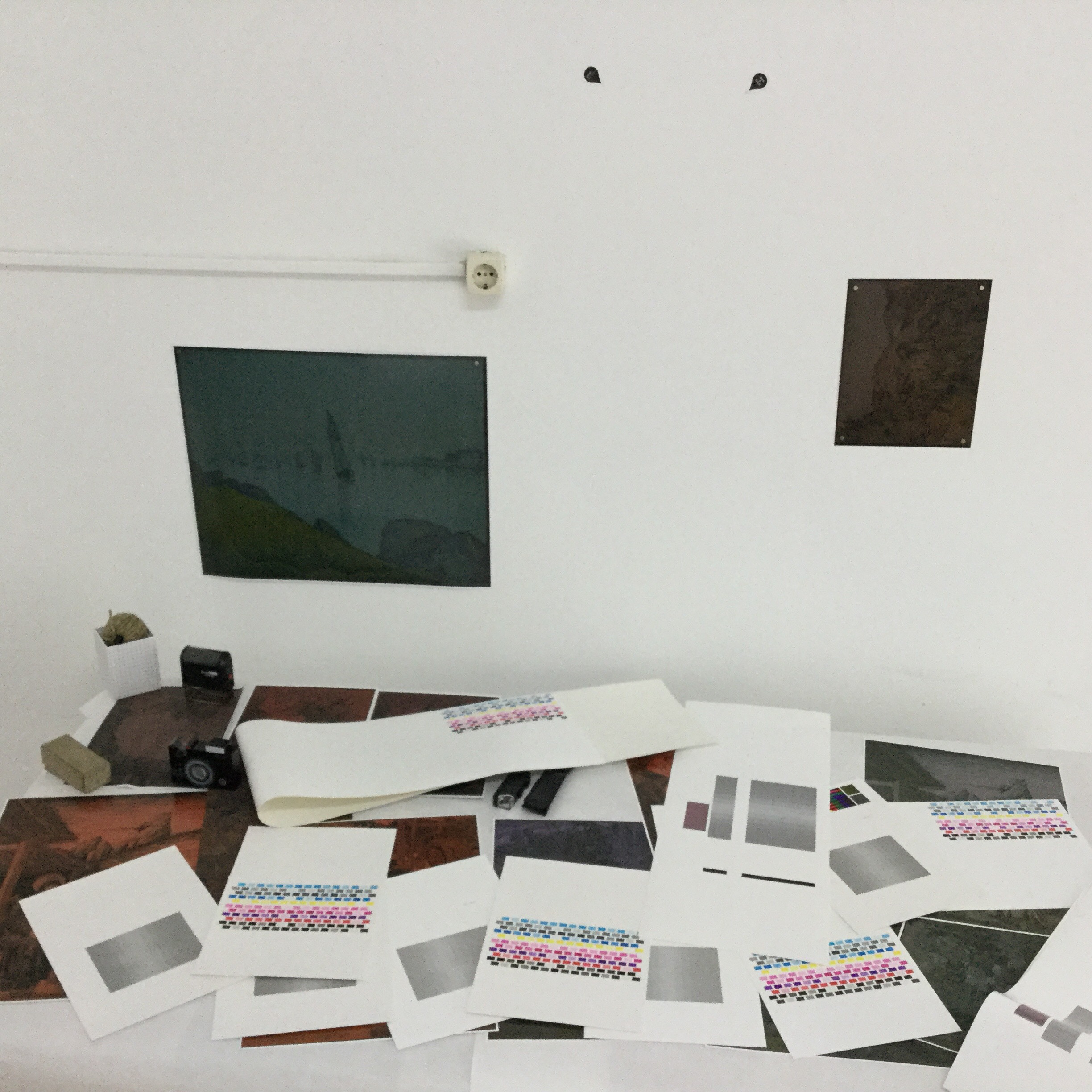
To solve this problem, I had to develop software, hardware and paper calibration technology to be able to reproduce the digital observation experience in printed form.
My digital and printed artwork is the result of the combination of different technologies that were necessary to calculate, create and produce the final RGB pixel colour artwork.
From artistic conception to completion, all of the series required more than two years to design and perfect across all digital and non-digital mediums(software, hardware, paper calibration and RGB colour palette refinement)
In my work, I strive to be a perfectionist, so I constantly try to find new ways to continue to perfect my technology and my artwork.
Overall, I feel that my artwork is an ongoing work-in-progress.
I am planning an international exhibition show to exhibit my artwork.
The Fine Pixel Art In RGB exhibition is an intimate artwork exhibition that combines programming, physics, human biology and is scheduled to premier in Madrid, Spain.
I plan to take the exhibition show to different cities around the world, and showcase my artwork for everyone that appreciate my artwork, and that want to know more about what I want to express.
Due to a variety of personal reasons, I slowly lost my passion for the work that I was doing, over a period of several years.
Unfortunately, I did not pay enough attention to it, and it reached a breaking point.
It's one of the worst things that it happened to me because this situation can break you mentally.
I decided to take a sabbatical year in late 2016 to seriously try to find my passion again, and stop what was happening to me.
I tried to find my passion again in many other areas, but I ended up deciding not pursuing them, because I lacked the motivation, and passion for them. I knew that I would not have enough passion to be happy on what I was doing.
My interest and dedication in finding more about the Art world came naturally in the last two years, and from just following the only subject I had passion about at the time of my sabbatical year, which was Quantum Mechanics.
All collections share a common theme: Red, Green or Blue vintage look.
The primary colours are expressed in every single pixel of the final recreated photograph, and also on the final combined vintage look.
This means, that I digitally draw and paint the photograph without actually creating any secondary colours inside each pixel.
And, thus the entire photograph is drawn and painted with just three colours: Red, Green, and Blue.
You can find out more information about my work, be reading my about page.
All print editions are available in three format sizes:
A4 – 8.3″ x 11.7″ & A3 – 11.7″ x 16.5″ & A2 – 16.5″ x 23.4″
Large commision works range from: 1.5m(W) x 1.5m(H) to Custom Size(W) x Custom Size(H).
Depending on the final produced artwork, the final image may not fit 100% the total viewable paper sheet/ or canvas.
I have different flavours for the collections mainly for two reasons:
First Reason: Light
The fundamental physical properties of Light are at the center of the colour definition that you observe.
And, I wanted my collections to have a Bright to Dark observing experience.
Each flavour that you observe: Originals, Reduced and Dithering contains this light brightness transition.
From Brightest(Originals) to Darkest(Dithering). The Reduced flavour lives in between the range of brithtness.
Second Reason: Historical
Pixel Art has its roots back in the 1970's, when the first colour computer systems were created, and it became famously known for its use in computer games.
At the time, computer technology was also in its earlier beginnings, and computer resources, such as memory was scarce.
This meant that ancient computers did not have enough memory to have a large spectrum of colour available to be displayed on computer screens.
So, different algorithms, such as colour reduction and dithering were used to display coloured images on computer screens.
In my flavours Reduced and Dithering, I implement my artistic algorithms to also pay tribute to that "Retro Pixel Art Era" where pixel manipulation began.
Sure.
In my flavour artistic algorithms, I express my artistic creativity and also have a different visual look and feel of the classic algorithms that were developed at the beginning of the "Pixel Art Era".
In my digital artwork, traditional Hatching and Cross-Hatching techniques are at the center of my artistic creations.
So, I also wanted to include that signature in my artistic flavour algorithms.
For example:
My Hatching flavour algorithm(left image) is an artistic variation of the classic Floyd-Steinberg dithering algorithm(right image), where by I use the traditional hatching technique as a means to enhance the details of color and objects, as opposed to traditional spot's.

All of the printed editions use Hahnemühle Photo Silk Baryta1 310gsm fine art paper.
All of the printed editions are printed on an internationaly award winning fine art printer: Canon imagePROGRAF PRO-10001.
Large commission works are printed on Canon imagePROGRAF PRO-60001.


The Collectors Album is normally oriented towards collectors that either do not have a sufficient wall space, or that are interested in preserving and collecting my artwork, with premier archive protection.
All of the Collectors Albums are hand-assembled by me, and are available for all formats: A4, A3, A2 print editions.
Yes, the Collectors Album is designed to allow new print editions to be added and saved on your Collectors Album.
After acquiring the Collectors Package, you can purchase future prints as the Standard Package, and save the print editions in your Collectors Album.
Because, I do not mass produce my work, orders are serviced on a first come, first served basis.
First order is produced first, and delivered first. Last order is produced last, and delivered last.
Everything is clearly explained to you, on the terms and conditions of this website.
You can visit the delivery packages page, and find out more details about each of the delivery packages.
Yes, I do.
Everything is cleary explained to you, on the terms and conditions of the refund policy of this website.
The images on my portfolio are not the HD original photographs that I digitally create.
The final created images are in the range of 101 - 103 larger than the original photograph.
And, that makes them unfriendly for navigating on my website.
The images are watermarked and compressed to allow a reduction in total size and create a more friendly website navigation experience on my website.
The compressed images, also compress the pixel manipulation detail but still provide a great web definition browsing experience of the final produced image.
All of the print editions that you receive are printed from the original HD photographs that I digitally create.
This way I guarantee that all of the printed artwork you will receive, has all of the resolution detail of the original HD recreated photograph.
And, that when it arrives, you can appreciate every single pixel creation.
No.
My artistic expression is expressed through a different digital medium: programming.
All of my body of work uses only photographs that are released under Public Domain Mark, and / or Creative Common CC0, and / or open access policy, or that have NO KNOWN COPYRIGHT RESTRICTIONS.
I do not use, nor I will ever use original photographs which Copyrights belong to another person(s)/institution(s), and /or that have not been properly released under Creative Common CC0, and / or open access policy, or that have NO KNOWN COPYRIGHT RESTRICTIONS.
In my body of work, I work only with photographs that have been released with open access policy by credible, and reputable institutions in the world of Art.
My artistic expression would not have been possible without their forward looking vision towards digital art progress.
I wish to thank the Courtesy of the following institutions(without any specific order in mind), for their open access policy towards the advancement of digital art progress:
No.
I do not use any type of commercial photo editing software to make any image/colour adjustements.
And, I also do not use or implement any sort of Artificial Intelligence(AI)/Machine Learning algorithm to perform any image manipulation.
Yes.
All of the printed material is entirely done by me. I do not use any professional printing company.
I enjoy maintaining the creative process until the final production prints are made.
But more importantly, I maintain the highest quality of industry standards in material and delivery of my artwork from the very beginning of my creative process.
No.
I work with a Macintosh and I use only Preview to send the image to the printer, based on the hardware/paper calibration for my printers.
Depending on the paper size, I create only custom paper sizes.
No, I do not.
My artwork is very different than a traditional fine art photographer that has to implement and follow strict Colour Management Workflow to reproduce the colour spectrum of the digital photograph.
The very specific nature of my quantum physical subject matter representation has lead me to develop proprietary technology to properly reproduce the RGB spectrum that I artisticaly designed to properly represent the observation experience across digital and printed forms.
Yes, all of my body of work is issued with a high quality Hahnemühle Certificate of Authenticity proof signed by me, and that I stand by 100%.
I do not mass produce my work, through mass-market online shopping.
All of my body of work, from artistical composition, programming, pre-production, digital printing, and preparation of shippement is prepared, and done entirely by me.
Please read the terms and conditions of this website, where all of the information is clearly explained.
You will find the information, and how you can exercise your right of right of withdrawal.
All Complementary Colours Are Painted Only By You.- Mário Sousa.®, Fine Pixel Artist.
So You Can Paint Your Colours. One Colour At a Time.

Is an international registered and protected trademark for Graphical Fine Art.